

Boho vibes and digital artistry
Boho vibes and digital artistry
An introduction to the photobook artistry of Anna Aspnes, plus a question for you

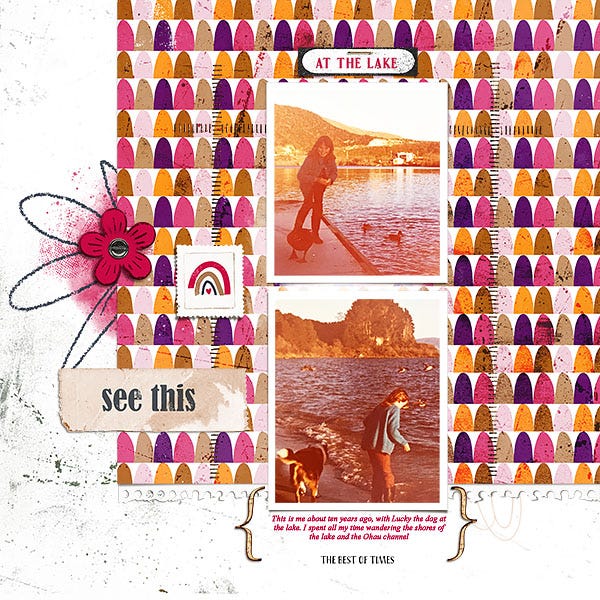
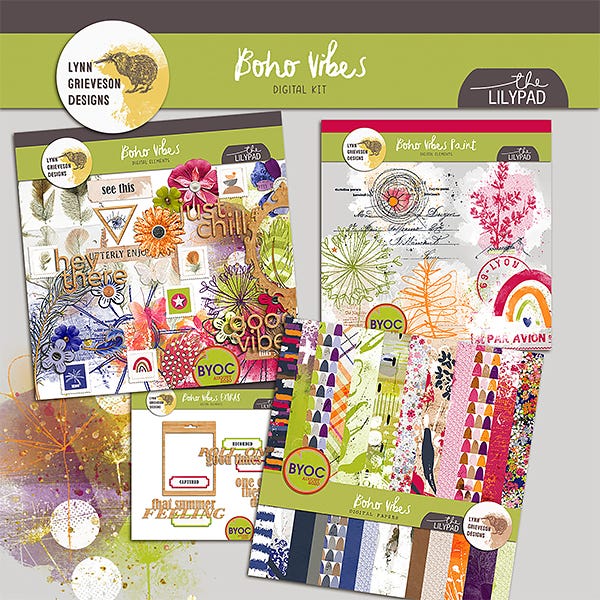
At the lake, created with “Boho Vibes” collection
LEARNING FROM THE ARTISTRY OF ANNA ASPNES
The amazing Anna Aspnes is a digital scrapbook designer that is one of the industry’s best not only at creating products (she sells at Oscraps) but also at creating her own photobooks for recording her family memories.
Anna has a unique artistic style of memory keeping - and is also brilliant at teaching her creative process so you can learn to make your own layouts and photobooks.
She has kindly given me a seat in her latest class, so I am excited to start playing along. It kicks off this week (but you can join anytime as there are class recordings you can watch and rewatch whenever you want, as well as downloads, layout inspiration galore, and a community to join). I’m really looking forward to playing along :-) You can find out more here

If you have an idea for a photobook but are not sure where to start, and want to make it something special, this is ideal, as it breaks the process down into steps, with lots of support, technical advice and inspiration along the way.
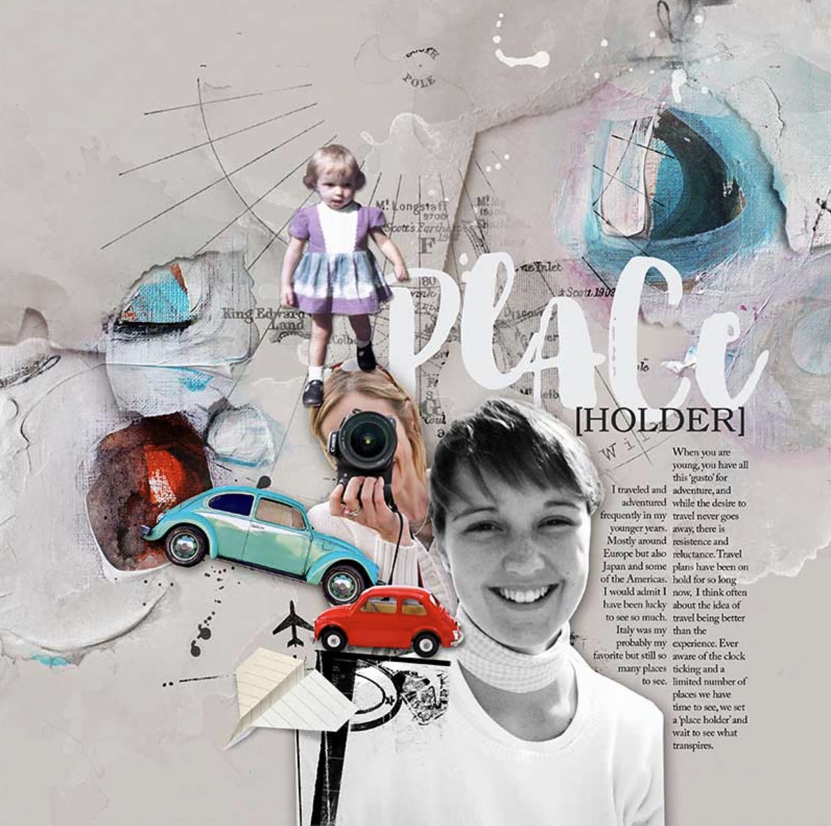
I love her description of the ‘Russian Doll’ concept, and watching the introductory session has already inspired me to start sometimes incorporating extracted photos on my pages. Anna has separate classes focusing on extracting, but if you want to experiment and you work in Photoshop, the select-subject tool is actually doing a pretty good job these days (depending on the photo you choose).
So watch out for that in layouts of mine to come …
And, if even it’s not the right time for the class just now, do check out the gallery of layouts using Anna’s creative assets, and her store, as it really is inspiring.
GOING BOLD
Generally I love a muted and limited colour palette for allowing the photos to shine and for ease of melding together the papers and elements I’m using. But sometimes it’s fun to go bold and to use things with much higher “contrast”. With the Boho Vibes collection I really leant into the brighter, highly-saturated colours that were part of the palette all The Lilypad designers were given to create with that month.
PS I’d love to hear what you think? Would you like to see more collections with a bolder coloured feel like this (alongside - not instead of - my more usual style)? Let me know!


Although slightly different from my usual, those pages above make me HAPPY! Meanwhile, the All That We Were collection is more typical of limited colour range, and I love the results of using that too. It’s all about fun in the end, isn’t it?


If you are enjoying my new newsletter, I’d love to hear from you - like or leave a comment and let’s connect. If you’ve followed a link here and are reading without a subscription - welcome! You might like to consider subscribing today for free to receive my future articles and updates in your inbox, and to support my small business.
