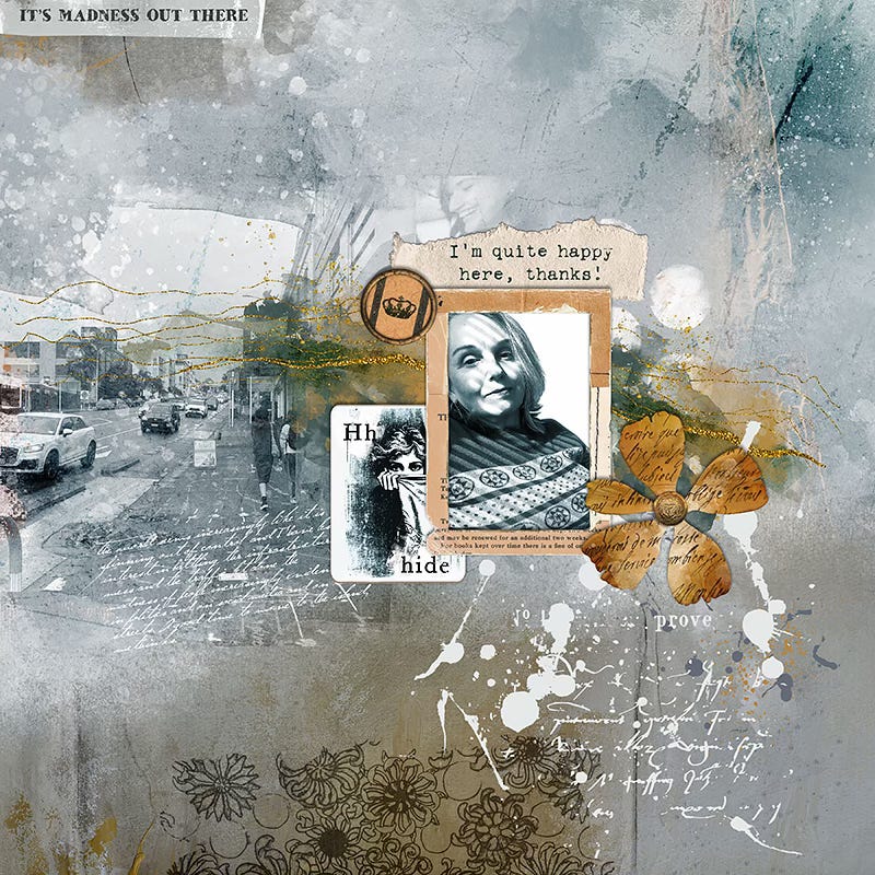
When I play with photos to make a digital mixed media page (and I nearly always do use photos for my creations), I am telling a story, but it’s actually more about conveying a mood. It’s about how I myself feel about the photo(s) I am creating with, and the memories and emotions they evoke for me.
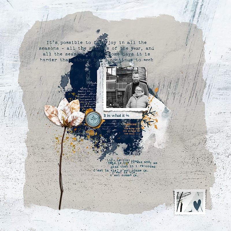
In the page above I wanted to create something about the journey I have been on, moving from a very fast-paced stressful environment in one city, to a less stressful life in another city and then finally to living on a dirt road in the middle of an island where I am quite happy no longer being surrounded by / dealing with people all the time.
We joke (but not entirely) that Sartre had it right when he wrote "L'enfer, c'est les autres" (Hell is other people). Most of the time we prefer the birds and the smartest collie in the world, especially after years of being exposed to the worst of human nature on display via the internet.
I feel like my expression in the photo, taken in our sunny but grimy inner city courtyard as we prepared to leave the city behind for the peace of the forest, sums up my feelings. I’d describe it as ‘jaded but content with my decisions’ ;-) … The stark contrast of the black and white means the photo pulls the focus on the page, but the lack of colour means that focus is very much on my expression. The blended in city street scene being black and white also conveys that ‘grittiness’.
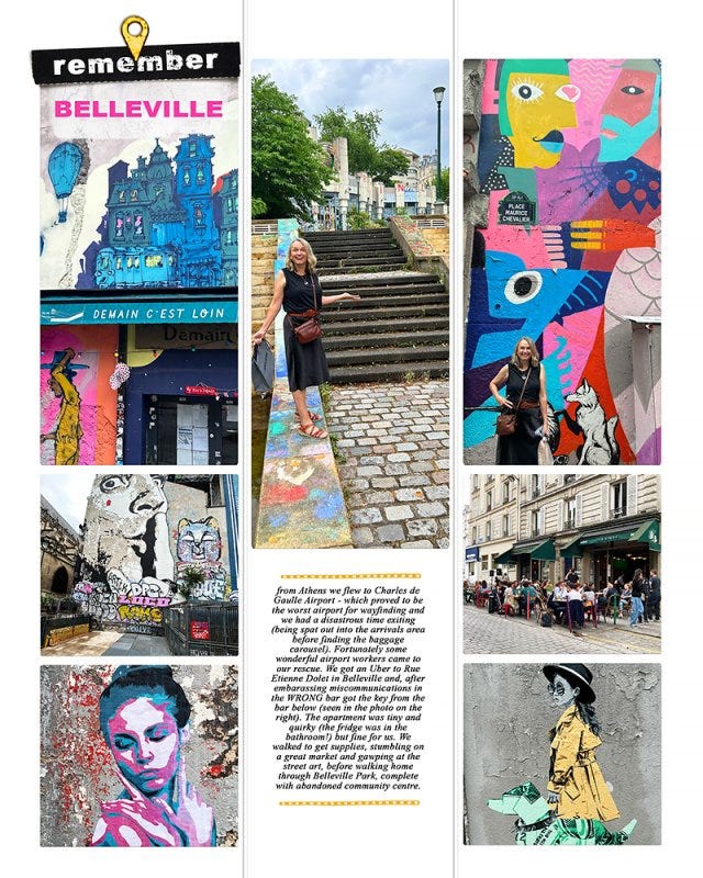
Of course, I often use the same photo more than once. In the first page below, in the photobook of our trip to Europe, I wanted to convey the gritty vibrancy of the streets of Belleville in Paris, leaning heavily into the colour of the street art and graffiti.
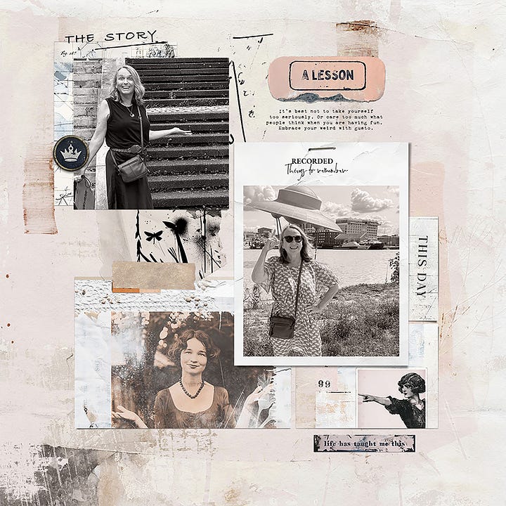
But in the second page I wanted to focus on how travelling enables me to just have fun, and how life has taught me to laugh at myself and not care what other people may think. The clashing colours in the different photos on that page would have been a distraction and detracted, rather than added, to the story I wanted to tell so turning them black and white (with a pinkish overlay) was my choice.
Of course travelling is not all fun and games. The story behind this photo in Japan is a really tough one. I needed to create a page with it that captured that sombre mood, and my bright red jacket would have detracted from that so turning it black and white (or sepia, rather) was a no-brainer.
In short: the beauty of digital photos and the ease of photo manipulation means there is no end to the different times or ways you can use any given photo, so I happily tweak them to convey the mood of the page I am working on at the time.
TURN BLACK&WHITE AND WIN
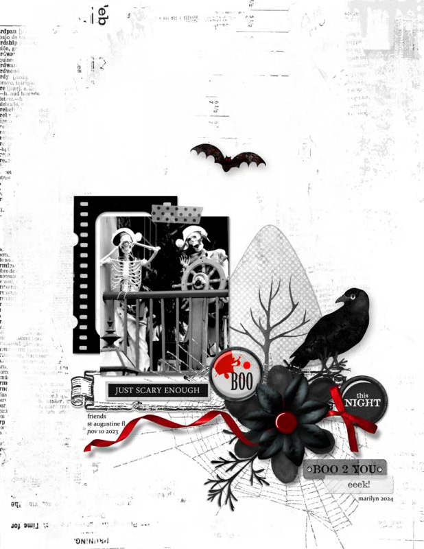
There’s a challenge on this month over at The Lilypad to go one step further and make an almost entirely monochrome black and white page, with just one pop of colour.
Here’s a great example by Marilyn, who is running the challenge:
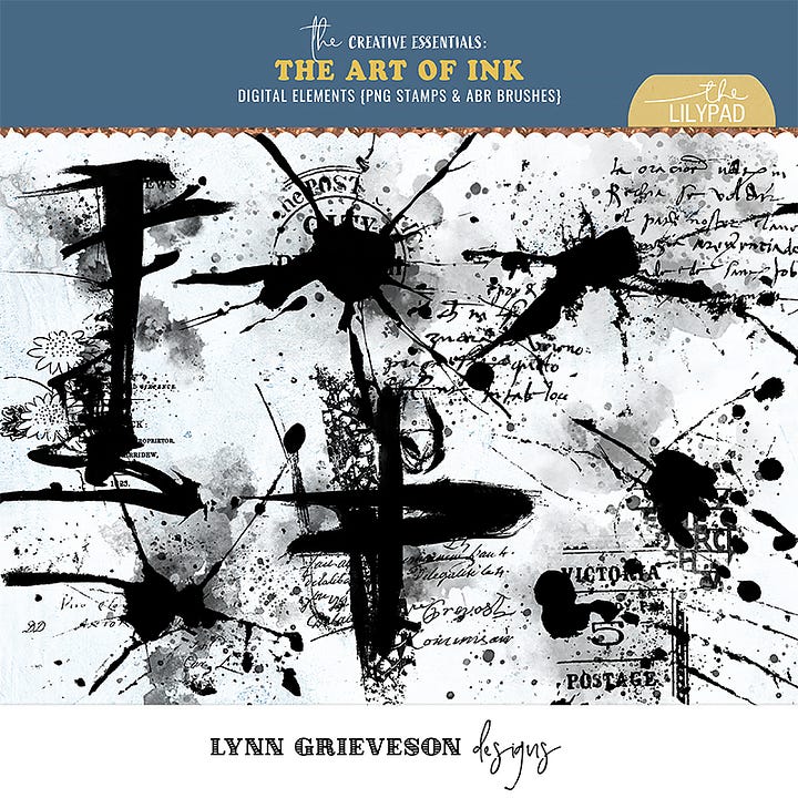
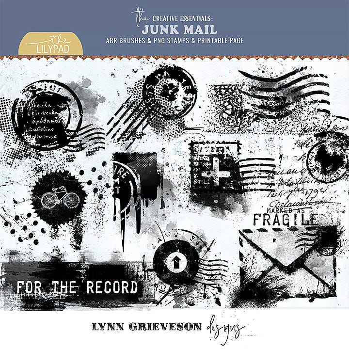
There is also my regular “featured” challenge, where you can create with any of my (reduced) featured designs. This month it includes some bold black ink brushes/ stamps:
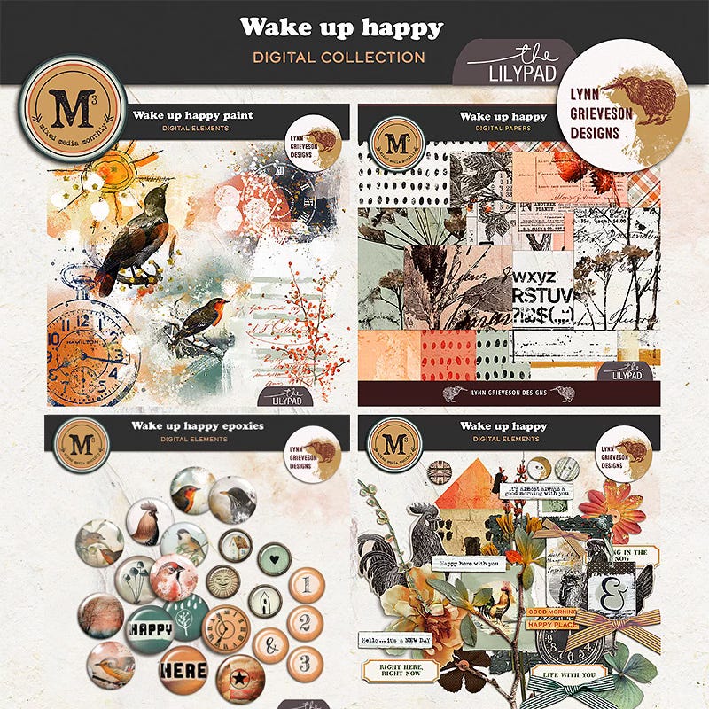
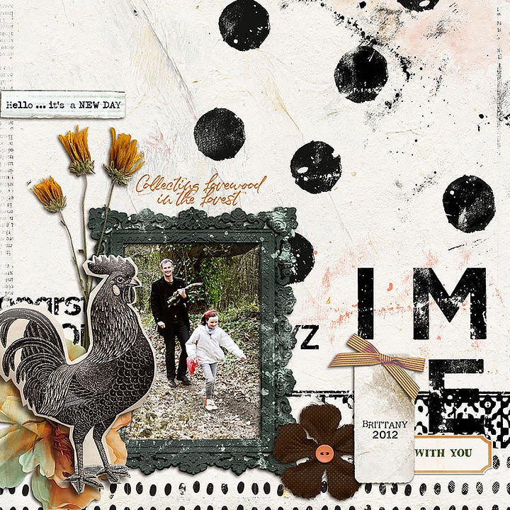
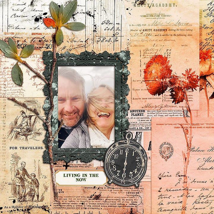
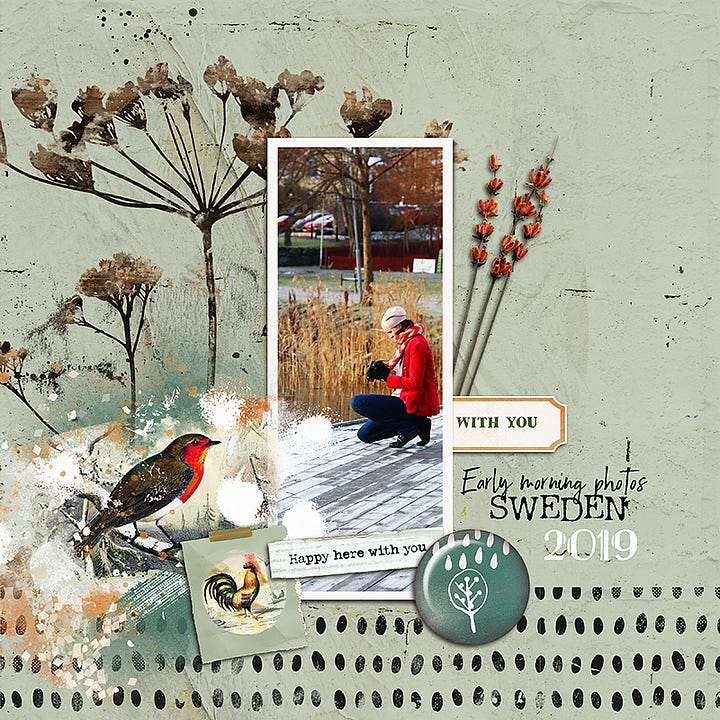
Or you can really lean into the colour with one of my favourite collections, “Wake Up Happy”
WHAT DOES GROWING MEAN TO YOU?
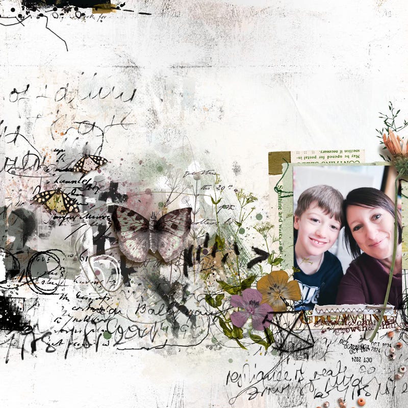
Also over at The Lilypad, Aly is running a challenge to create a mixed media page on the theme of ‘growing’ - whatever that means to you.
Here’s a lovely page by Rachel Jefferies of Pixels, Paper and Paint using three of our HMV collections:
If you are enjoying my new newsletter, I’d love to hear from you - like or leave a comment and let’s connect. (And, if you haven’t already, you can subscribe for free to receive new posts in your email AND some freebies that will arrive in your inbox after you sign up).


