NEVER UNDERESTIMATE WHAT YOU WILL FORGET
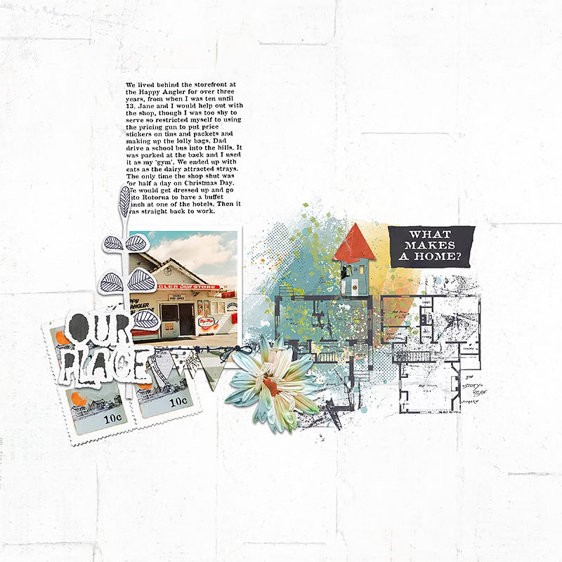
I had a lesson in this recently, when I had the idea to make a new photobook about all the places I have lived.
In my defence, they number well into the 30s.
But for a few of them I had to call on my parents for the actual address and they struggled to remember. And at least three of the addresses from my 20s and 30s had disappeared into the recesses of my mind too. Thank goodness for google maps, and being able to go on a virtual detective’s walking tour to verify the street numbers!
Even so, when I read my initial list out to my partner he looked at me and said ‘what about Sydney and Canberra?”
Yes, I had skipped a whole country when making the list!
Anyway, I think the completed book will be a useful record for me when I am (even) older, for my daughters, or even for some random person who buys it at a thrift shop .. (I create with no expectations, let’s just say)
Long story short, it’s interesting how the everyday and mundane becomes fascinating as circumstances change and time passes.
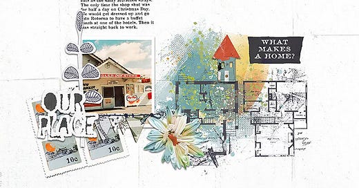
A few other homes pages by me:
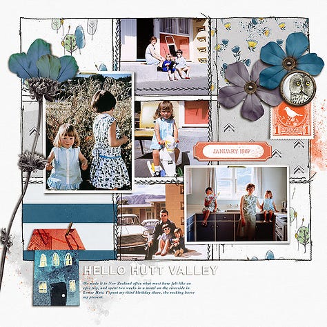
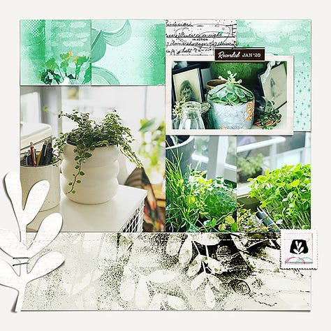
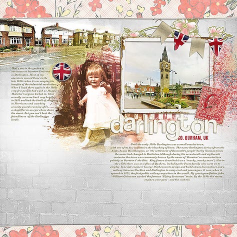
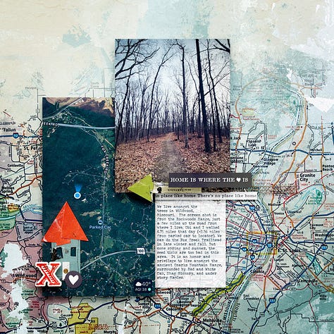
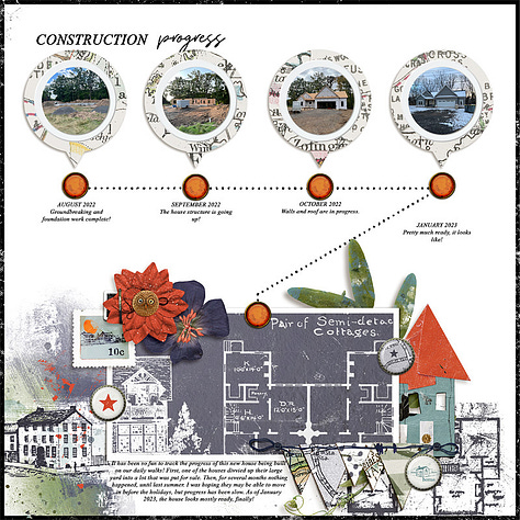
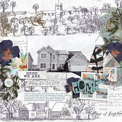
I love these ‘home’ pages by Lisa and Cristina using the “No Place Like Home” collection:
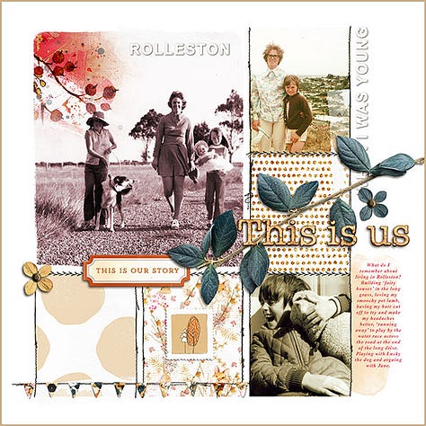
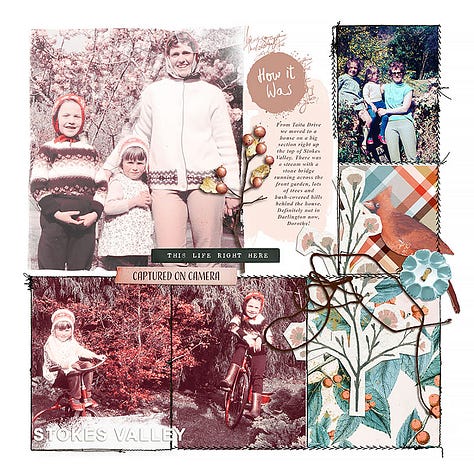
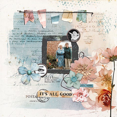
As well as recording places, I love creating with all everyday photos from the past:
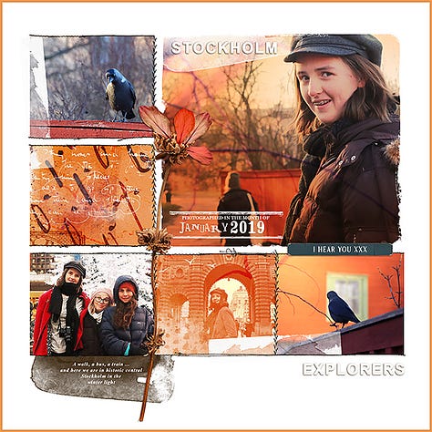
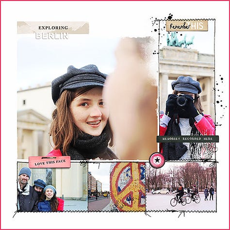
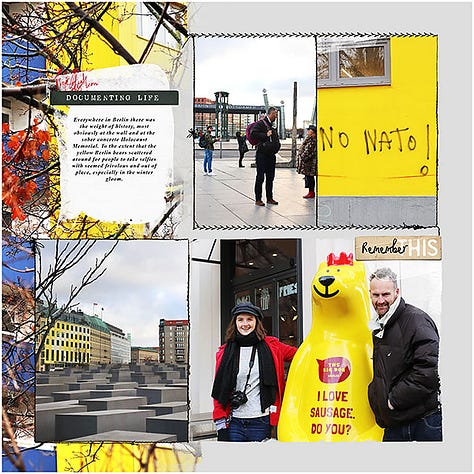
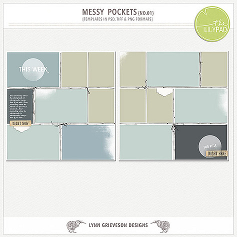
But of course, I can’t go past the ‘red letter days’ and adventures. The travel photobooks are such a joy to create, and relive as you do. The templates I return to over and over for making these are “Messy Pockets Boxed”
FYI As I write, the “No Place Like Home” collection, the “Messy Boxed Templates” - and more - are part of the midweek event at The Lilypad. You can find them here for a short while longer:
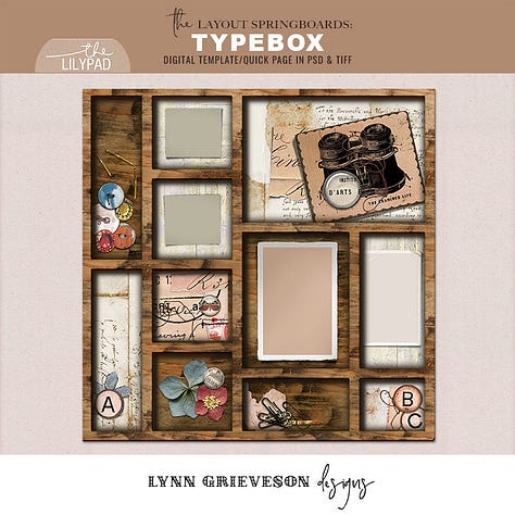
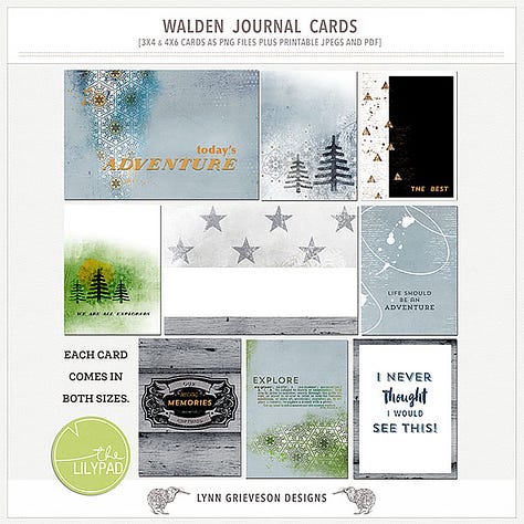
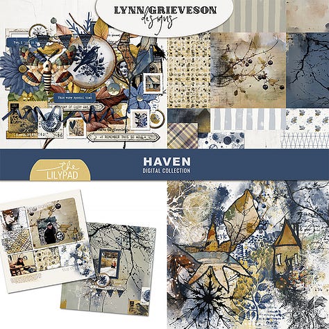
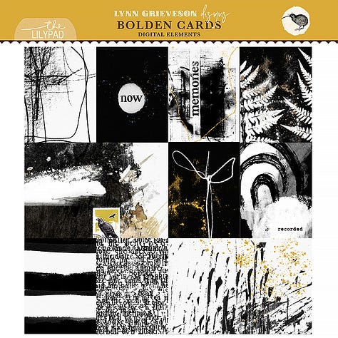
Also: don’t forget that for just a few days longer, you can find this month’s featured collections here:
Hi there! Before you go I want to say thanks for reading my Substack blog and showing an interest in what I create. If you are enjoying ‘Life in Pictures’, I’d love to hear from you - like or leave a comment and let’s connect. (If you haven’t already, you can subscribe for free to receive new posts and some welcome gifts in your email.
You might also like to download the Substack app to see extra notes and find other great creative inspiration from around the Substack world). Thanks again :-)




In terms of colour, I can definitely see what you mean when talking about(in previous posts) using colours from the actual photos to set the tone/theme for each page. It makes for a nice motif to guide the eyes, which I've noticed doesn't travel in the normal left to right direction like they would for a regular book.
I'm also a bit of a nerd so I'm really liking the use of building blueprints in some of the pages, nice touch.